


Color Combinations: The Power of Yellow
Whether it's boosting energy or stimulating your brain, the power of yellow should not go unnoticed.

I began a small series (and by began, I mean started last week) sharing mood boards of color combinations I create.
I love color and it’s power, so I thought I’d take it a step further and share more about why I chose what combinations I did and how I curated them. I thought I’d be fun to give you a peak inside my brain and my creative process.
For the first week, I used red, because it’s the color I’m most comfortable using believe it or not. Red goes with everything in my opinion and can be used as an honorary neutral.


But this week, I wanted to challenge myself to play with yellow.
Yellow is a tricky one for me. When designing, I use yellow to create intentional chaos or create a moment of attention - not traditionally as the primary color everything is built on.
Making yellow carry the weight of an entire brand or project has always felt risky to me. But after creating these mood boards, I think it’s a risk I need to start taking.
Keep reading for a deeper look at each color combination:
Pink + Yellow

Creating the palette: I was drawn to more golden peach tones for this palette to make it feel more soft and feminine. I found myself attracted to imagery that has a shimmery overlay, as well as imagery that had movement, to bring depth to the palette. Frankly this one took me a long time because I couldn’t get it just right.
When building a palette that’s soft, it’s tricky to find balance without adding an accent color. Instead, I leaned toward adding shadows and texture to introduce that needed depth.
What it could be used for: A feminine brand that is looking to convince the world they are more than just a “girl’s” brand. This direction is soft but commands attention through it’s shadow, texture, and movement.
Blue + Yellow
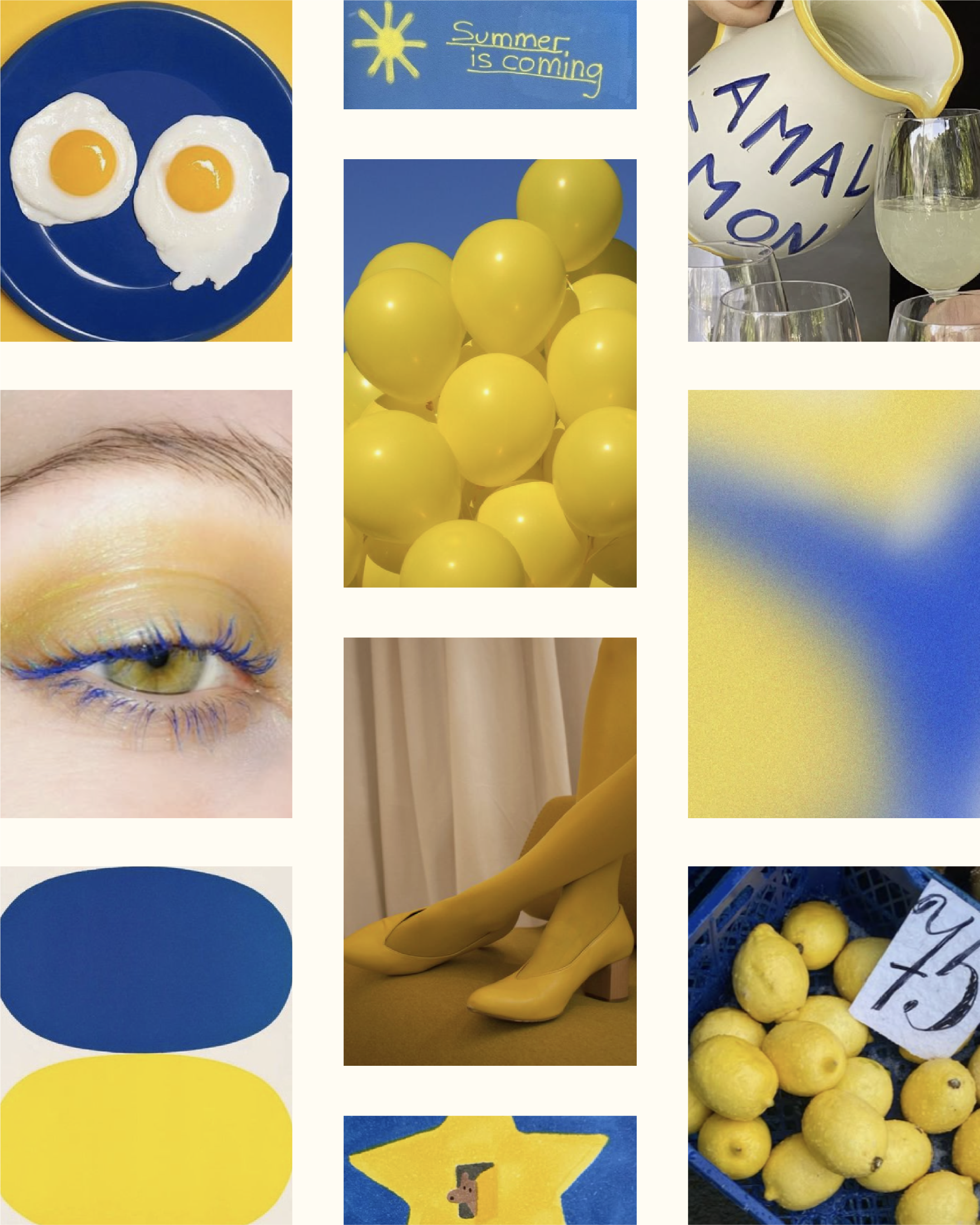
Creating the palette: This palette may be my favorite. If only because it includes my favorite color; cobalt blue.
The brightness of the blue and yellow feel like an injection of summer. For this palette, I felt more inspiration through art. At first the direction was feeling juvenile but introducing shape and gradient through imagery helped modernize it.
What it could be used for: A summer ad campaign. I envision this direction being used to tell a specific story. The colors draw attention and keep you engaged because of their boldness. `
Keep reading with a 7-day free trial
Subscribe to Riley's Substack to keep reading this post and get 7 days of free access to the full post archives.